A novelist on hiatus (but a lover of stories in any medium). Soundtrack enthusiast. Part-time tech geek. Jesus freak.
22 stories
·
1 follower

Workflow 1.1: Deeper iOS Automation

1 Comment

Released by a small team of indies in December 2014, Workflow reinvented iOS automation. Combining an interface reminiscent of Apple's Automator for OS X with easy access to native iOS features such as Safari, the photo library, and iOS 8 extensions, Workflow promised to make automating tasks on an iPhone and iPad a simple and pleasant affair. The results spoke for themselves: Apple selected Workflow as Editor's Choice, the app trended for weeks in the App Store's Top Charts, and thousands of users released interesting and useful workflows in various online communities. MacStories readers may remember that Workflow was my iPad app of the year.

Workflow is one of those few apps that have dramatically changed how I work on my iPad. For me, the point of using Workflow isn't to put together chains of actions to show off the app's power – I just want to save time I can spend doing something else. While I have fun experimenting with Workflow and understanding its capabilities, ultimately the app just sits there in the background, waiting for me to call a series of actions I need. I love Workflow the most when it's summoned for those two seconds and it does something magic that would have normally required minutes of manual interaction. Things like appending links to Evernote, converting spreadsheets to Markdown tables, or adding text to the clipboard.

Workflow fits my routine like a glove. I've used it every day to automate aspects of my work that speed up how I write and communicate on my iOS devices. And with Workflow 1.1, released today on the App Store, its developers are further expanding the app's capabilities with powerful new functionality that includes filtering, better conditionals and image manipulation, URL expansion and deeper calendar access, and even the ability to open multiple links at once in a web browser.

Version 1.1 of Workflow includes over 50 new actions and dozens of fixes, improvements, and changes to existing actions. Core parts of the app have been revised for a faster experience and the foundation laid with the Content Graph has started to pay off with the addition of metadata and filters. Because I've been playing around with Workflow 1.1 since the app's original release two months ago, I'm going to offer some practical examples with a high-level overview of the changes.

UI Improvements

Workflow's interface has largely stayed the same, but there are some refinements and additions worth noting:

  • You can quickly run workflows by double-tapping them;
  • You can duplicate workflows;
  • There's a confirmation dialog the first time your run a workflow downloaded from the web;
  • Downloading a workflow with the same name of an existing one no longer overrides it;
  • You can now use your own images for Home screen icons.

I particularly appreciate the quick-run shortcut as it means less tapping around the app, and I'm grateful for the ability to duplicate workflows. That comes in handy when I want to have similiar workflows but don't want to bother recreating one from scratch or exporting it to reimport it later.

I still think that the developers should consider ways to run Workflows from the action extension without showing the flow of actions every time (double-tap or tap & hold in the share sheet maybe?), but, overall, the UI/UX fixes in this version are smart and they pave the way for the true core of version 1.1: new actions and filters.

Long URLs, Safari Selections, and Textshots

Safari is one of my most used apps on my iOS devices, and I also spend a good amount of time on Twitter, Pocket, and NewsBlur. I deal with a lot of URLs on a daily basis, which means I'm happy to see an Expand URL action in Workflow 1.1.

Before 1.1, I had created an action to turn shortened links into unfurled ones using LongURL. I don't like it when I'm forced to share a shortened link to a webpage I want others to read and reference, which is why I setup the workflow to expand links for Pocket, Nuzzel, and other apps. With Expand URL, I can drop a single action into my workflows and throw away all the steps required to expand links manually. Expand URL can follow multiple redirects, and, in my tests, it worked perfectly for links shared from a variety of iOS apps.

In addition, Workflow 1.1 introduces the ability to pass selections from Safari to the app's action extension. One of the most glaring omissions in version 1.0, the ability to select text from Safari and use it contextually to the native share sheet as text or HTML further increases the scope of the app and how it can be used to automate web tasks – and I'm taking advantage of it in a useful way.

0 to 100, real quick.

0 to 100, real quick.

I used to have a workflow to expand URLs and share real links from Pocket and Nuzzel. Thanks to Workflow 1.1, I have enhanced that workflow to:

  • Use a selection from Safari if present, enclosing it in double quotes;
  • Use a selection from Pocket/Instapaper if present;
  • Always expand links thanks to Expand URL;
  • Support textshots with built-in cropping.

This new workflow lets me always share expanded links and quotes no matter the app I'm using. I find it particularly handy in Pocket, as I can share a link or a link plus a quote if I trigger the workflow from the copy & paste menu (same for Instapaper).

Cropping a textshot in Pocket with Workflow.

Cropping a textshot in Pocket with Workflow.

Also, I realize that text is better shared as actual text, but I find the so-called textshots to be useful and informative. Twitter isn't using Cards to provide summaries of web articles (they're just snippet previews with no user control over what gets previewed) and the practice of using textshots leverages Twitter's timeline design to fake rich text previews that you can create.

Following an exchange with MG Siegler a while back, I settled on a specific textshot style: sans-serif text with a sepia background pulled from Pocket. The idea of using the app's sepia theme for these came from MG, who noticed that yellow screenshots had more contrast in Twitter's native apps.

A tweet composed in Pocket that contains an expanded link and a textshot.

A tweet composed in Pocket that contains an expanded link and a textshot.

With Workflow 1.1, I can have a single workflow that unifies Safari selections, third-party apps, expanding URLs, and attaching screenshots to tweets. I don't even have to leave the app I'm using: I can take a screenshot, pick it directly from the Workflow extension, edit it with the built-in crop tool, and send the resulting text, link, and picture to Twitter (and any other iOS app) via the share sheet. I use this workflow several times each day and I've reused many of its components elsewhere in my workflow library.

You can download it here.

Append Links to Evernote

Another existing workflow that benefited from the Expand URL action is my Append to Evernote one.

Every day, I add links to Evernote notes that I keep for Virtual and MacStories Weekly. Each week, I go through these notes, reopen all the links to double-check them, and I move them to other documents we keep for the podcast and our newsletter. Then, I wipe the notes and start over, saving new links in them.

As you can imagine, I don't like it when Pocket or NewsBlur append shortened links to my notes. I want to see the full domains in there (useful to, say, know if I'm linking to the same source too much at a glance) and Expand URL lets me quickly resolve URLs and use them in Evernote (appending text to a note is also visibly faster in Workflow 1.1).

You can download the workflow here.

App Store Affiliate Links

Expand URL can also be used to obtain unfurled links from unusual suspects, such as the App Store.

I often want to share affiliate links on MacStories and Twitter and, ideally, I'd like to do so directly from the App Store app, which I already use to browse new releases and updates. While I have a solution in Python, getting links from an API isn't the most convenient (or visual) way to browse results.

With Workflow 1.1, I can hit share from the App Store, choose my workflow, and let the app expand the appsto.re short link into a proper itunes.apple.com link for the selected item. Then, using a variable and a list (that you'll have to modify to your needs), I can construct an affiliate link with my token and campaign parameter.

Tweeting an affiliate link from the App Store with Workflow.

Tweeting an affiliate link from the App Store with Workflow.

I could have used my Python script to grab results from the iTunes API and the output would have been impeccable. With Workflow, I can achieve the same results from the App Store, which lets me see screenshots, changelogs, and other app information.

You can download the workflow here.

Open Multiple Links at Once

Here's where things start being amazing (and crazy): Workflow can open multiple links at once in Safari and Chrome – multiple tabs, all at once.

iOS apps can't normally do this, and I was curious to know how the Workflow team managed to pull it off. With the same Open URL action that you're already using to open links in Safari, you can pass a list of URLs to the browser and watch as multiple tabs will be opened in front of you. But how?

It turns out, there's a trick involved. To open multiple links at once, you'll have to tap a button in a middle step that will launch a special webpage in Safari/Chrome. This webpage (its address begins with 'data:text') contains the information of multiple URLs and you'll have to confirm the action by tapping a large button in the middle of the screen.

This is a bit of a hack, but it works, and it's faster than copying and pasting URLs, especially if you have a dozen of them. This works particularly well for my Append to Evernote workflow: when I need to recall all the links I've saved, I can launch a workflow and the app will scan the specific note for links and it'll open them all in Safari.

The same concept can be applied to my workflow for appending text to the system clipboard. Want to copy a bunch of links and have them open in Safari all at once? All it takes is two actions in Workflow 1.1 (Get Clipboard > Open URLs) and perhaps a shortcut in Launch Center Pro to speed things up even more.

You can download Open Evernote Links here and Open Links here.

Images from Safari Selections

I often want to copy image URLs from a webpage in Safari, but sometimes the browser doesn't let me get an image's link. Given Workflow's new Safari selection abilities, I created a workflow to get a selection from a webpage and find image URLs in it.

To parse Safari selections with Workflow, you'll need to enable the action extension mode and make sure a workflow can accept Safari webpages as input. As I demonstrated with the Long URL workflow, you can also use the Get Type action on input passed to the extension and, if it's returned as 'Safari web page', treat it accordingly. Workflow action extensions will interpret webpage selections as rich text, which you can convert to HTML for proper parsing with an action.

The workflow does exactly this: it gets a selection from Safari, turns it into HTML, then scans it for URLs that contain image extensions such as JPEG and PNG. The workflow removes duplicate links and then brings up a list where you can tap a link to copy it to the clipboard and open it in a new Safari tab for additional confirmation.

A similar take on this idea allows me to turn screenshots into smaller files I can use for featured posts (the ones you see at the top of this website). By accepting Safari selections as input, Workflow can perform a series of conversions through the Content Graph and use Get Images from Input to return image files from rich text.

At this point, I can use the updated Choose from List action to pick an image from multiple ones, resize it with a new Resize Image action, and preview it with Quick Look. From the preview window, I can upload it elsewhere with the built-in share sheet, which doesn't require an action as it's part of Quick Look itself. When I'm done uploading and I dismiss Quick Look, the workflow gets the newly created image link from the clipboard and opens it in a new tab.

You can download Extract Image Links here and Resize Safari Image here.

Search Pocket

Since I started using Pocket as my read-later app (again) late last year, I've enjoyed the ability to run full-text search queries with my Premium subscription. I often want to find articles I've read, and maybe I only remember a sentence or a name. Pocket search helps me find articles using what I remember from reading them rather than a specific set of parameters I may forget (such as title or author).

Workflow 1.1 has two new Pocket actions to add and retrieve articles. The latter has been useful in my case, as it contacts Pocket directly without forcing me to search in the Pocket app, which can be slow. Once authorized, Pocket will look for articles matching specific criteria in your account, and it'll return results as article titles and URLs.

Searching for an article from Launch Center Pro and opening multiple results in Safari at once.

Searching for an article from Launch Center Pro and opening multiple results in Safari at once.

Combined with Launch Center Pro, I set up a workflow to search Pocket by typing a query, opening Workflow, and waiting for results to come back from my account. Workflow can look in your Archive and Unread lists as well as All articles; it can try to fetch a tag, run a text search, and you can also limit the number of results Workflow gets from Pocket. It would have been nice to sort results by parameters such as author name or publish date.

This workflow fits nicely with Launch Center Pro and it's a good one to have if you're a heavy Pocket user. Obviously, if multiple articles are returned by search, you'll be able to select them and open them all in Safari or Chrome at once using the Open URL action. I often save multiple reviews for the same app or videogame in Pocket, and being able to retrieve them on the fly with Workflow and get all their real URLs in one place helps me reference them later in other places.

You can download the workflow here and associated Launch Center Pro action here.

Filtering: Crop and Combine iPhone Screenshots

One of the most powerful new features of Workflow 1.1 is filtering, which allows you to dive deep into the app's Content Graph and access properties of files and other iOS features that weren't previously exposed. If you're making complex workflows that deal with a lot of variables and files, filtering alone opens hundreds of new possibilities for fine-tuned results and conditionals.

To properly understand filters (and searches, also based on the same system) let's back up for a second and mention the Content Graph. From my original review:

For Workflow, Weinstein and team created ContentKit, a custom iOS framework that is capable of taking a collection of content items and intelligently coerce them into another format. The ContentKit framework powers the Content Graph, which is a “map” of how input from iOS features and apps is translated throughout workflow actions on the fly. The content transformations that Workflow does and that puts in the user's control are based on a complex technology that allows Workflow to integrate apps and services that are seemingly unrelated, such as Maps and iBooks or Music and Twitter.

And:

Workflow's Content Graph extends to every input type supported by the app – whether it's a web link, plain text, a webpage, a song, a PDF, or a video. In theory, any action output can be turned into a compatible input for a subsequent action, creating combinations such as “turn webpage to PDF” or “choose photo, upload to Dropbox, get a public link, and share it”.

Workflow was already smarter than most iOS automation apps because it could understand file and data formats, coercing them to something different if necessary depending on actions used in a workflow. With filtering, the data types recognized by the app can now be refined according to specific properties, generating an output that matches criteria specified by the user.

Filtering photos is a good example of this, and I'm going to use it to illustrate the new workflow I made to crop, combine, and upload screenshots to MacStories.

For over a year now and for reasons that I've explained elsewhere, I've used a series of Python scripts to clean the status bars of my screenshots, combine multiple ones in a single image, and upload them to our CDN. The system is, I believe, as optimized as it could ever be, but results aren't always perfect. With time, I've grown tired with the limitations caused by the status bar cleaning script (such as having to display an active WiFi connection) and I've considered whether simply cropping the status bar would put an end to my nitpicking. I'm still not completely sold on the idea of cutting the status bar from my screenshots, but my curiosity gave me a nice opportunity to test Workflow's new filtering and editing tools.

Workflow has long been able to get screenshots from your photo library, outputting images that match the file format and size criteria of screenshots. With the new Filter Images action, however, you can go way beyond the simple “screenshot” type and make sure you get exactly the kind of screenshot you need. In my case, I want Workflow to only return iPhone 6 screenshots in portrait mode.

The Filter action places a series of optional conditions at your disposal that you can mix and match. You can ask Workflow to return images where height is greater than 1334 pixels, where orientation is up, where time taken is between 7 PM and 10 PM, and you can add as many filters as you want and say whether you want all or any of them to be true. There are dozens of filters available in Workflow 1.1 for a variety of data types, and the results they return can be sorted, ordered, and limited.

The customization enabled by filtering makes, in many ways, Workflow an entirely new app. What's impressive isn't necessarily what Workflow is able to natively retrieve on iOS – after all, the app could already access photos, music, etc. – but the depth and control in the user's hands and how that can help people save time.

In version 1.0, for example, I could ask the app to show me screenshots, but I couldn't specify “iPhone 6 screenshots”, so I was forced to pick them manually. Now, I can set up filters to find the kind of images I need, sort them, and even put them in a popover with useful thumbnails.

Because Workflow now understands metadata, you can also get details for individual files or data types after you've filtered them from a larger collection. In my workflow, I use a Get Details action, which lets me retrieve standalone bits of data such as location or time taken and that isn't just available for images. Workflow can get details for locations (street, ZIP code, city, etc.), files, (file size, name, etc.), and even Music from a user's library. The amount of metadata exposed by Workflow is huge and it's no surprise that the developers took their time to bring it to the app in a way that made sense and was user-friendly.

In this case, I use Get Details to grab an image's width and height values, which I then use to select a portion of an image I want to be cropped. This is another new action in the app: you can crop any image programmatically (that is, without interacting with an interface) by setting a position, coordinates, and width/height values. By using a custom position and removing 40 pixels from the top of an iPhone screenshot (where the status bar is), I can end up with a full-sized iPhone screenshot without a status bar. No scripting – just visual actions.

There's more. For over two years, I used a script to combine images – i.e. putting two portrait screenshots side by side because I think they look better than a single screenshot in blog posts. Workflow 1.1 can do this with an action. Define a direction (vertical is also supported if you want to stitch multiple screens together), set a spacing, and multiple images will be combined into one. That's another script replaced by a visual action that works the same way.

I can now crop and combined screenshots directly from the Photos app with extensions and Workflow.

I can now crop and combined screenshots directly from the Photos app with extensions and Workflow.

The rest of the workflow is unsurprising. After ending up with cropped and combined screenshots (both optional), I call the system share sheet to send the resulting image to Dropshare, which uploads it for me. Then, Workflow launches Pythonista, which sends my CDN URL to Kraken for further image optimization.

I won't be deleting Python scripts from my iPad and iPhone any time soon, but Workflow is making a strong case for a new way to handle status bars and image combination. With filters and visual actions, I can enjoy more consistent output with less errors and faster results, which gives me time to do something else. But, even better, Workflow's action extension allows me to edit and upload images directly from the Photos app, which I can't do with Pythonista. The ability to select images from the app I always use to organize them is a huge plus, and I've been enjoying the integration of different parts that Workflow brings with the ease and convenience of visual actions.

You can download the workflow here.

Crop iPad Screenshots

This workflow is a modified version of the iPhone one. It looks for iPad screenshots in my photo library, crops them, and uploads them using the same system I described above.

Thanks to filtering, the workflow can look for images that are 2048 or 1536 pixels wide using the “any” parameter of the Filter Images action. This allows me to find screenshots taken both in portrait and landscape mode, even though the majority of screenshots on this site are in landscape. Once I'm done picking, I crop the status bar, upload, and watch as Workflow sends the output to Pythonista. Again, I can run this workflow from the Photos app through Workflow's action extension.

You can download the workflow here.

Calendar Times and Location Filters

As I mentioned above, the ability to filter data types and files has been brought to several aspects of Workflow's iOS integration, and that includes the Calendar. By accessing local calendars you've set up on your devices (such as iCloud and Google Calendar), Workflow will not only be able to return event information and lists of upcoming appointments, but also to filter Calendar data according to calendar-specific parameters.

So, I built a workflow to know when I'm supposed to leave home and pick up my girlfriend at class. Obviously.

Through an action called Find Calendar Events, you can return a list of events from any configured calendar and apply filters to return a subset of events that match criteria defined in the action. You can use dates, event titles, locations, alarms, and other typical event metadata as filters for events you want Workflow to retrieve.

In my case, I want events that:

  • Begin in the next 12 hours;
  • Have my girlfriend's school as the location;
  • Are from my Personal calendar.

Furthermore, I want to sort them by start date and show them in a list. From this list, I want to pick one and I want the app to tell me in how many hours it is. I can do all this with no scripting and just a bunch of premade actions in Workflow 1.1.

The core of the workflow is a series of calculations to get the current date, get the date and time for a selected event, and compare the two to find how many hours are in between them. Fortunately, Workflow ships with new Date actions that allow you to get the current date, get a specified date, and even convert a date to different time formats such as short, medium, and relative.

To display a message like “Three hours from now at 8 PM”, I use a relative time format, which doesn't require any additional calculations to pinpoint an event x hours or minutes from the current date and time. I like how the Workflow team brought date and calendar actions to the app and, even if some parts could have been explained better1, the integration is top notch and I keep imagining new uses and ways to mix actions for my Calendar and more.

As for this workflow, I added it to the Home screeen with a nice heart icon, so now I can quickly know when I'm supposed to leave and how much time I've got left for writing or cooking my girlfriend a nice dinner. Not bad for an automation app.

You can download the workflow here.

Photo Flashbacks

The last workflow I created for this article is another demonstration of filtering and a riff on one of Everpix's most beloved features: photo flashbacks.

The idea behind photographic flashbacks (also explored by Timehop, Dropbox Carousel, Picturelife, and, most recently, Photo Flashback for iPhone) is that people like to compare the current day to the same day in the past through photos. I like to see how my life has changed over time, and photo flashbacks provide a visual, natural, and intimate way to observe our lives through the iPhone's lens. And all this can be replicated with Workflow 1.1 using filtering and metadata.

The underlying principle is that you can filter photos based on date taken. Combine that with the ability to subtract an arbitrary amount of hours/days/years/etc. from the current date, and you end up with a way to tell the app what “a year ago” means in two actions. Furthermore, because the Adjust Date action supports adding and subtracting whatever you want from a date, you can even manually enter the amount of days you want to go back in time – normally I'd guess 365, but you can enter any other number. Or, just remove the Ask When Run token, set the action to 1 Year, and forget about it.

At this point, you can easily imagine how filtering photos works: you can find all photos where Date Taken matches the date calculation you performed and also add a “Photo is a not a screenshot filter” to make sure you only get photos from your library.

The workflow shows multiple photos from the same day if present, allowing you to pick one to view it with Quick Look. Additionally, the workflow will also try to fetch the photo's location from its metadata and turn it into a Maps tile thanks to the Content Graph. This will let you remember the photo as well as where it was taken on a particular day – all without leaving the app or sharing your personal data with a web service because it's all contained in the photo metadata exposed to Workflow.

Photos and locations in a single workflow.

Photos and locations in a single workflow.

The problem with this workflow is that results can be hit-or-miss if you use iCloud Photo Library. In my tests with 9 years of photos available in the Photos app, Workflow often didn't see photos that I had previously downloaded (i.e. cached offline) from iCloud. My understanding is that the app needs better support for photos stored in iCloud – I don't know if it's possible for developers to implement this, but it'd be nice to ask Workflow to show me photos that have been downloaded, as well as look for any photo and then download its full-res version when I need it.

What I put together is a basic structure – you could connect this workflow with a daily reminder in Due to check your photo flashbacks, make it email your relatives or friends every day, fetch photos from specific albums, and more.

You can download the workflow here.

1.1

Version 1.1 of Workflow further solidifies its originality. There's nothing else like it on iOS. The deep integration with iOS envisioned by the Workflow team was already unique with the app's debut last year. Filtering takes it to a new level, enabling tons of new ideas and use cases.

In a few months (I first started testing Workflow in August 2014), Workflow has become an essential component of how I get work done on iOS. The improvements and features launched today extend the app's capabilities deeper into native iOS frameworks – whether you want to find photos, filter files and calendar events, or save selections from Safari, Workflow is becoming a command center for iOS that can do anything. It's powerful, and there are still a few issues to fix, but it's useful, and, even better, it's fun.

Workflow is the most exciting app I have on my iPhone and iPad. Version 1.1 is available on the App Store. You can read my original review here.


  1. Did you know that you can parse natural language dates with iOS' built-in data detectors and Workflow 1.1? Or that you can combine variables and the Ask When Run token in the same field, useful to confirm the creation of new calendar events (which Workflow can also do now)? Or that, if you choose to create a new event in Workflow, you can have instant date validation as you type? Yes, more about this in a separate article. 

Read the whole story
benwhiting
3565 days ago
reply
Great rundown by @viticci of the updates in the latest version of the most powerful app in iOS.
Fort Worth, TX
Share this story
Delete

Fantastical 2.2: Interactive Notifications, Share Extension, and Today Widget

1 Comment

Fantastical, developed by Flexibits, has long been one of my favorite calendar apps for iOS. Since the app's first release over three years ago, I've come to expect my calendar to support natural language input; after the launch of version 2.0 for iPhone, Fantastical showed me why I wanted my todo list to be integrated with the calendar with excellent and seamless support for iCloud calendars and reminders in a unified experience. Reminders, however, turned out to be a problem for me as I switched to Todoist earlier this year: I've started using Sunrise – which is a great app – to see my events and todos in a single list, but I'm constantly missing Fantastical's natural language support, advanced features, and polished design.

Fantastical 2.2, available today on the App Store, brings iOS 8 features that allow the app to be more easily integrated with iOS workflows thanks to a share extension and that extend the app beyond its silo with actionable notifications and a widget.

Before iOS 8, I never turned on Fantastical's notifications because they couldn't have the same level of integration found in Apple's native Calendar and Reminders apps. I enjoyed the ability to mark reminders as complete or snooze them from Apple's notifications, and I didn't want to miss that kind of shortcut with Fantastical notifications.

iOS 8 allows Fantastical to send interactive notifications that are (mostly) on par with Apple's. In my tests, I turned off Apple's notifications and activated Fantastical's for events and reminders. For events, Fantastical can show banners that, once swiped down, reveal a Snooze button to postpone an event. Tap the button, and Fantastical will open showing the selected event with a popover for snooze shortcuts and manual controls.

The same concept applies to reminder notifications as well, with one more option: you can complete reminders without actually opening the app by tapping Complete on a notification. I don't use Reminders on a daily basis anymore, but interactive notifications are extremely handy and an unquestionable improvement.

What I was most excited to try was the Fantastical share extension, which enables you to create events or reminders from any app. Fantastical has always been good at removing friction from the event creation process: the interface is easy to use, natural language can be used with dictation for quick voice input, and the app supports a few URL schemes to automate it with Launch Center Pro and Drafts.

Fantastical's share extension in Safari.

Fantastical's share extension in Safari.

With version 2.2, Flexibits has built a powerful share extension that brings the full Fantastical interface to any app that can share text and links. From Safari, Drafts, Digg, and other iOS 8 apps that properly support share extensions, you'll be able to tap the Fantastical icon to get the app's complete UI for event and reminder creation. The same screen that you see in Fantastical is available as a system-wide extension that you can use to quickly save bits of text and URLs into the app (and thus iCloud).

What I like about Fantastical's share extension is that it's not a compromise – unlike other iOS 8 app updates, it's not a bare-bones share sheet where you can type text with no other controls or menus. Flexibits has brought the full-blown Fantastical UI to a share sheet that has all the controls you're used to. You can type natural language commands and the extension will parse them; you can set times and location; and, you can show more details to have complete control over what you're saving into the app. When activated from Safari, for instance, the URL of the current webpage will be automatically placed in the URL field of an event or reminder, saving you the process of pasting the link manually.

Fantastical's share extension in Digg Reader.

Fantastical's share extension in Digg Reader.

The result of the share extension is that it's now easier than ever to start using Fantastical as a replacement to Apple's apps – it's ubiquitous. Fantastical may not be triggered on smart data detectors in apps like Mail and Messages, but its presence in the system share sheet lets you create events and reminders anywhere, which, once again, confirms how democratizing iOS 8 is for third-party developers (and the fact that Apple really needs share sheets in Mail and Messages).

The Fantastical widget was the best surprise of this update. I've been trying a few calendar widgets over the past month, but none of them provided the combination of features that I wanted: a month calendar that lets me tap on days to view events for that day in a list. This is exactly what Fantastical does with its Today widget.

Various configurations for the Fantastical widget. All this can be changed in the app's settings.

Various configurations for the Fantastical widget. All this can be changed in the app's settings.

Fantastical's widget can be configured to show a full month calendar, display “today's upcoming events”, or a combination of the two. In practice, this means that, by default, the app will show events for the current day, but it'll also show events for days you tap in the calendar.

I'm a fan of the month visualization in the widget: you can tap days (which have colored dots for events) and weekends are highlighted if you've enabled the option in the app; events are ar listed chronologically, they're color-coded, and you can tap one to open it in Fantastical. Reminders can be completed from the widget (and, unlike other todo apps, they will sync to iCloud in the background directly from the widget), and you can navigate across months from the widget by tapping the arrow buttons next to a month's name.

I've been using Fantastical's widget on my iPhone and iPad every day as its let me see my entire schedule at a glance with a swipe from any app, giving me a quick overview of my agenda. Combined with the Todoist widget, my Today view now has a clean summary of my appointments and tasks that makes me save time because I don't have to constantly open individual apps anymore.

Fantastical 2.2 doesn't fundamentally reinvent Fantastical, but the iOS 8 integration it delivers is a step above the competition and shows how Flexibits deeply knows the iOS platform. Interactive notifications and a full-featured share extension let Fantastical reach beyond the confines of the app, enabling users to mark or create items anywhere on iOS (as long as there's a share sheet). The widget is my favorite aspect of Fantastical 2.2, and the proverbial icing on the cake for a solid and polished iOS 8 update.

Fantastical 2.2 is available on the App Store, with both the iPhone and iPad versions currently on sale ($2.99 and $7.99, respectively).

Read the whole story
benwhiting
3681 days ago
reply
Fantastical is amazing, and it's no surprise their new Today Widget is also amazing.
Fort Worth, TX
Share this story
Delete

Unbiblical Notions of Work

1 Share

Especially in a challenging economy, some people take the perspective that you should work whatever job you can, because the most important thing is to make money and earn a living from your work.

This perspective can sometimes sounds virtuous at first. And, of course, earning a living is indeed an important and essential component of work. If you can’t earn a living at your work, that turns it into an a-vocation, not a career.

However, there is actually something very un-Christian in that view of work. The problem is that it has turned making money into the chief and leading principle for our work. But that is not to be the case. Making money in your work is only one component among at least two others to which we are to give chief consideration in choosing a job.

That perspective of work outlined above subordinates the equal importance of finding work for which you are a good fit to the cause of financial gain. That is not right. It dehumanizes people and robs them of their ability to find real fulfillment in their work and, ultimately, make their greatest contribution.

The great Christian thinker Dorothy Sayers captures this perfectly in her short essay “Why Work”:

At present we have no clear grasp of the principle that every man should do the work for which he is fitted by nature. The employer is obsessed by the notion that he must find cheap labour, and the worker by the notion that the best-paid job is the job for him.

Only feebly, inadequately, and spasmodically do we ever attempt to tackle the problem from the other end, and inquire: What type of worker is suited to this type of work?

People engaged in education see clearly that this is the right end to start from; but they are frustrated by economic pressure, and by the failure of parents on the one hand and employers on the other to grasp the fundamental importance of this approach.

Steve Jobs often said “you need to love what you do.” I’ve seen some Christians stalk down about that, saying things like “well, I have to live in the real world — I can’t afford the luxury of seeking a job that I love.”

But without even knowing it, Steve Jobs was actually reflecting a very Christian view of work. And, as Jobs knew, this is actually the perspective that tends toward the greatest economic success in the long-run as well, for it is impossible to excel over the long-term at work that you don’t enjoy.

Finding work that you love is not a luxury. It is an implication following from the Christian view of work — namely, that work is not only about economic realities, but as Sayers also says, something that should be looked upon “as a way of life in which the nature of man should find its proper exercise and delight and so fulfill itself to the glory of God.” That reality needs to be upheld right along with the economic purpose of work. Anything else is a truncated view of work, and to say “but I need to live in the real world” is the easy way out and actually lazy.

To those who say “but what if sweeping floors is the only job you can get; shouldn’t you take it?” The answer is, first, the biggest problem with this question is that it seems to assume that there is no one out there who actually likes sweeping floors. But beyond that, most of the time people asking this question are settling too easily. If you are literally going to starve if you don’t sweep floors, then sweep floors. But don’t stop there. While sweeping floors, hold on to your aspirations to find the work that is a good fit for you, and keep looking for it.

Too often, people fall into the fallacy of using economic realities to bludgeon people into giving up their aspirations and dreams. Why do we have to settle so easily for the “either/or”? As in “either you are a dreamer who wants to find the work that fits yourself well, or you can live in the ‘real world’ and do work you hate but earn a living.”

I reject that dichotomy, as all Christians should. It is unloving, un-Christian, contrary to the nature of human beings in the image of God, contrary to the reality that work is intended by God to be more than economic, contrary to God’s very own purposes for our work and, ironically, in the long-run it is also contrary to the legitimate economic aspect of work.

Read the whole story
benwhiting
3704 days ago
reply
Fort Worth, TX
Share this story
Delete

A running list of the most notable updates to the best iOS apps

1 Comment

Today, iOS 8 is available for most iPhones and iPads. And many, many great app updates are shipping this week. Below, we’re collecting a list of the most notable updates and the best new apps. We’ve also written brief descriptions of the updates so you can know what to look for.

This is a “living” post, so check in to see what’s been added as new apps go live in the App Store.

You can follow us on Twitter as well.

Table of Contents

Here’s a list of all the updates we’ve posted so far (14 apps plus a couple quick tops to let you know how to get the Notification Center widgets and the system-wide extensions working). far. Clicking one will take you to our short overview of what’s new in the app. Clicking the (app) link will take you to that app’s page in iTunes.

Widgets in Today view of Notification Center

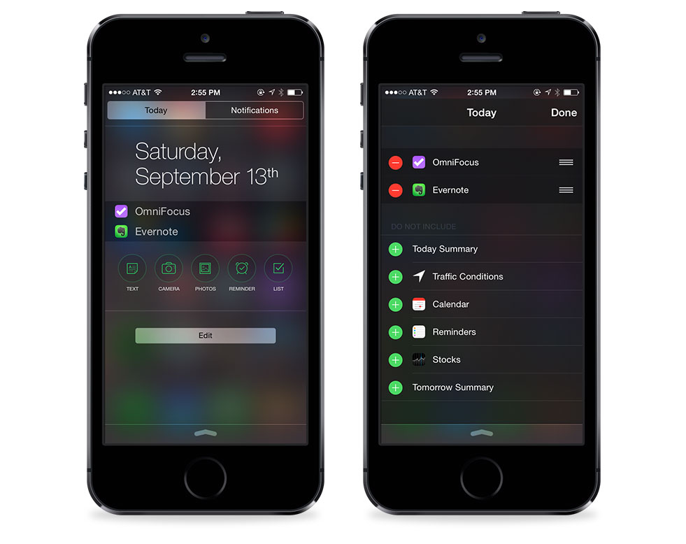
One of the new features of iOS 8 is the ability for developers to offer widgets for the Today view in Notification Center. This is going to allow some great new functionalities for those apps that take advantage of quick input (like Evernote) or a quick glance at your to do list (like OmniFocus). iOS doesn’t allow developers to turn those on by default, but the process to turn them on is really simple.

iOS 8 Notification Center Today view

To enable a widget, pull down Notification Center and then switch to the Today view. Hit the Edit button at the bottom. You’ll then see all of the apps that you have installed that offer widgets for the Today View. You can customize what apps will appear and you can also rearrange the order in which they appear.

Enable app sharing extensions

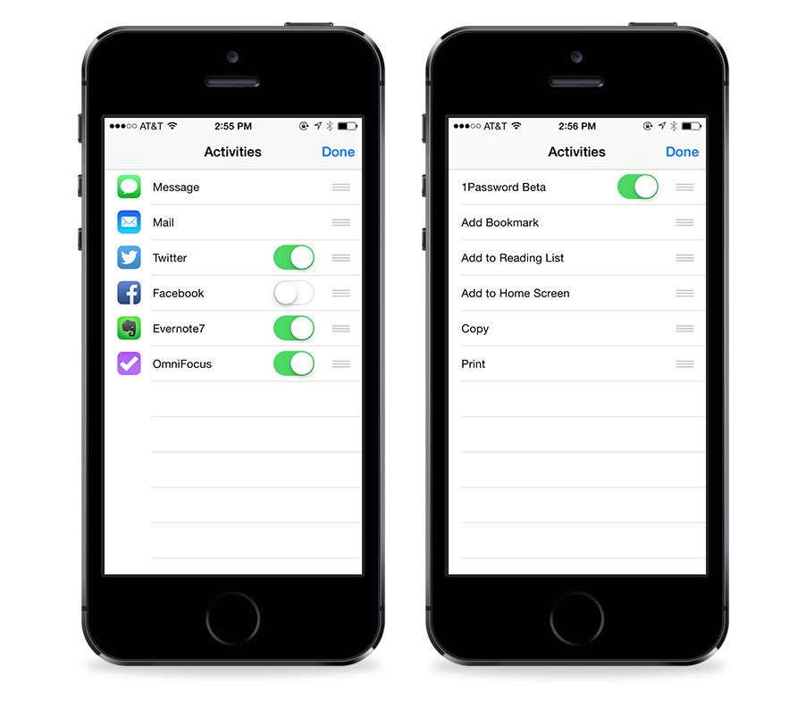
The ability for apps to share data amongst themselves is one of the great new features of iOS 8. A perfect example of this is using 1Password to log in to a secure website in Safari. Another example would be sending a PDF from Safari into a specific Evernote notebook. It’s important to note that each app must have its extensions turned on (even after installing an update with extensions built in).

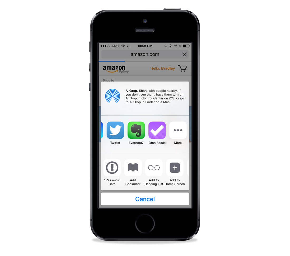
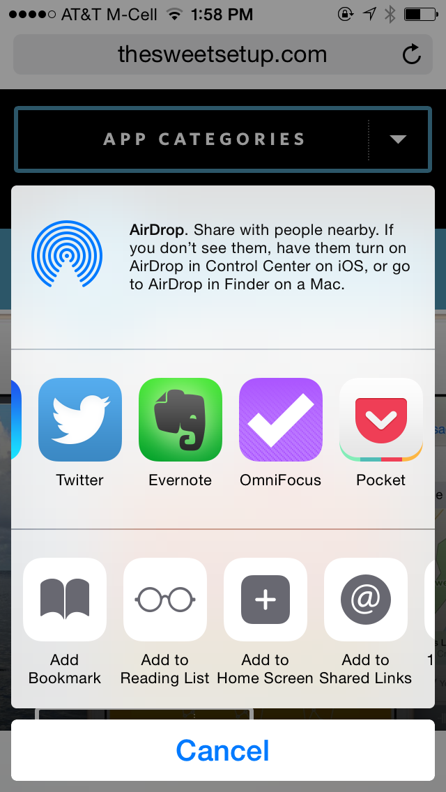
From any share menu, you can swipe to the More button on the top row. This menu allows you to manage which apps will be included in the sharing menu. This can include Twitter, Email, Evernote, etc. You can flip them on and off and reorder them.

iOS 8 sharing menu

On the second row, you can manage extensions that can interact with the app you are using. This is where the 1Password extension will be useful with Safari. They are turned on and off using the More button at the end of the row.

iOS 8 app extension options

OmniFocus for iPhone »

The Omni Group is one the longest running Apple developers in history. Founded in 1989, they’ve gone through a number of shifts in the Apple ecosystem. Since the birth of iOS, they’ve been at the forefront of high quality and premium apps. With iOS 7, they released OmniFocus 2 for iPhone. Now they’ve released an update to OmniFocus for iPhone that takes advantage of some of the new iOS 8 features.

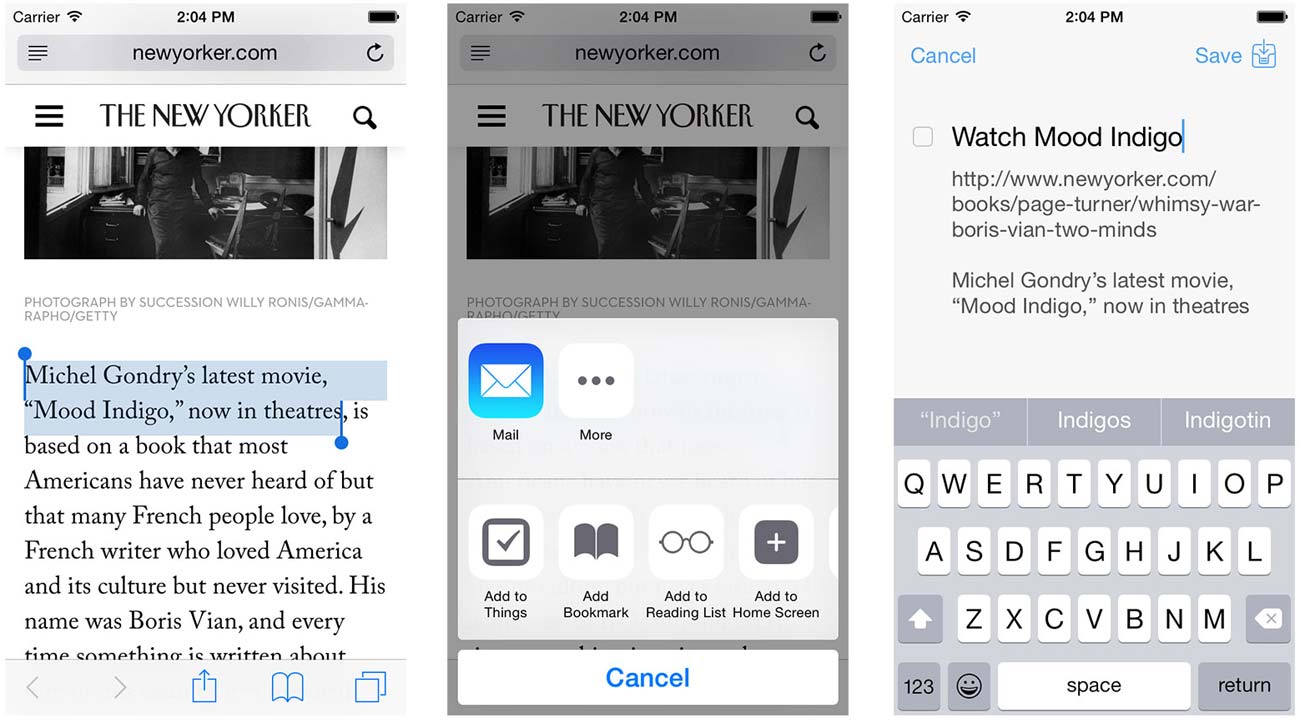
OmniFocus Sharing Extension

If you are in Safari on iOS, you can tap on the share sheet and send the website to an OmniFocus task, though you’ll need to enable OmniFocus on the share menu first. You’ll also be able to assign a project and/or context, or just send to your inbox.

OmniFocus 2 sharing extension in iOS 8

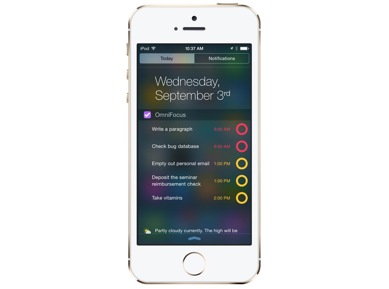
The OmniFocus Today View Widget

OmniFocus also has the option of displaying your due items as a widget in your Today view screen inside of Notification Center. This will be great for quick glances at your tasks that are due today.

omnifocus-iphone-today-widget

PCalc »

PCalc is the best professional-grade calculator on iOS. If you want a calculator that has lots of power features but values its user interface above all, you’ll want PCalc.

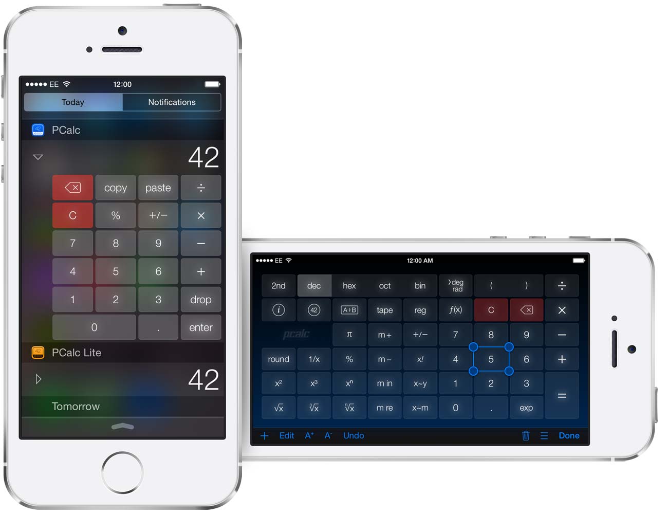
New today is PCalc version 3.3, and with it comes a slew of fantastic new features. For one, PCalc has been updated to work on iOS 8 and to be optimized for the new larger screens of the iPhone 6 and 6 Plus. It also supports Handoff, so you can continue your current PCalc calculation on another device. And there is a Widget which puts a basic calculator into Notification Center.

Additionally, PCalc now allows custom layouts. You can move, edit, and resize any button on the calculator.

The update is free for current users, and new users can pick it up for $9.99 on the App Store.

Calendars 5.5 »

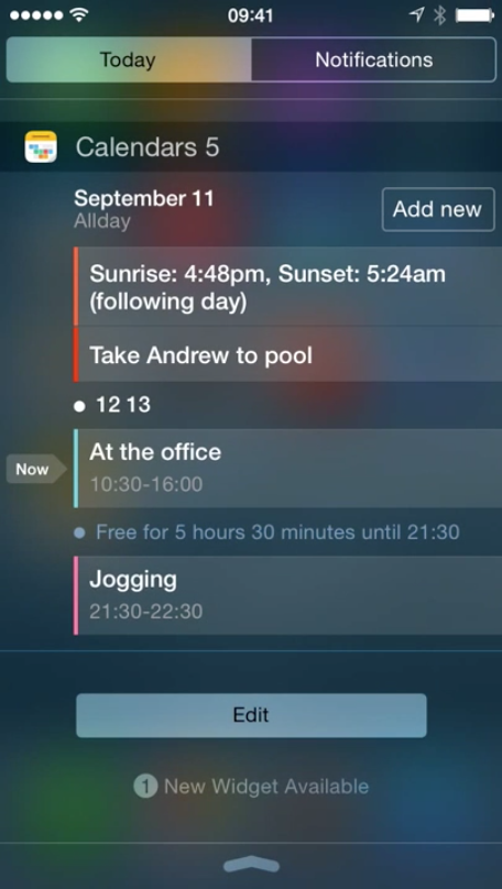
Calendars 5 is an excellent iPhone and iPad calendar app, which we heartily recommend. Its update for iOS 8 includes a widget in the Notification Center that shows you all upcoming tasks and events at any time. And in addition to viewing your schedule, you can also create new events right from the Today menu.

Calendars 5.5 for iOS 8

Pocket version 5.6 »

Pocket released version 5.6 of its iOS app that allows you to save items for later. Up until now, saving articles from Safari on iOS required a bookmarklet. While Pocket did a great job of explaining the process, it was still a two-step process to install it, and it required copying and pasting some javascript code. With iOS 8, Pocket has simplified the process in Mobile Safari with a sharing extension — you even have the option of tagging the article before sending it to Pocket.

pocket-share-extension-iphone

For Premium subscribers, tags will be suggested based on relevance. You can read more on the Pocket Blog.

Note that for some, the Pocket Share extension is not working. The team at Pocket is aware, has reached out to Apple, and is working on a fix.

Evernote updates »

Evernote is one of those apps that has been around for a long time on iOS. It does a lot. In fact, it does so much that I struggled to understand how to use it in my life for years. Evernote is an “everything bucket.” It can hold text, photos, audio, movies, and almost anything else digital. The Evernote update for iOS 8 contains 2 new features:

  1. Notification widget
  2. Safari Extension

Evernote’s Notification widget

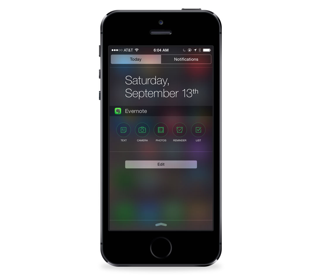
With iOS 8, apps can now offer the option of including a widget that users can install on their “Today View.” Evernote has built in support for this by allowing you to quickly create a certain type of note.

Evernote Today view in iOS 8

If you frequently create new notes on iOS, this will be a great addition for you. I’d love to see an option to do a search window as well. I frequently search within my Evernote database, so this would save me a step.

Evernote’s Safari Extension

The Evernote Web Clipper is one of my most used Safari Extensions on the Mac. While I use Pocket for saving articles that I want to read and discard, I save articles to Evernote that I want to keep forever. The Web Clipper allows me to do just that. With iOS 8, Evernote now has a simplified version of its desktop clipper on iOS.

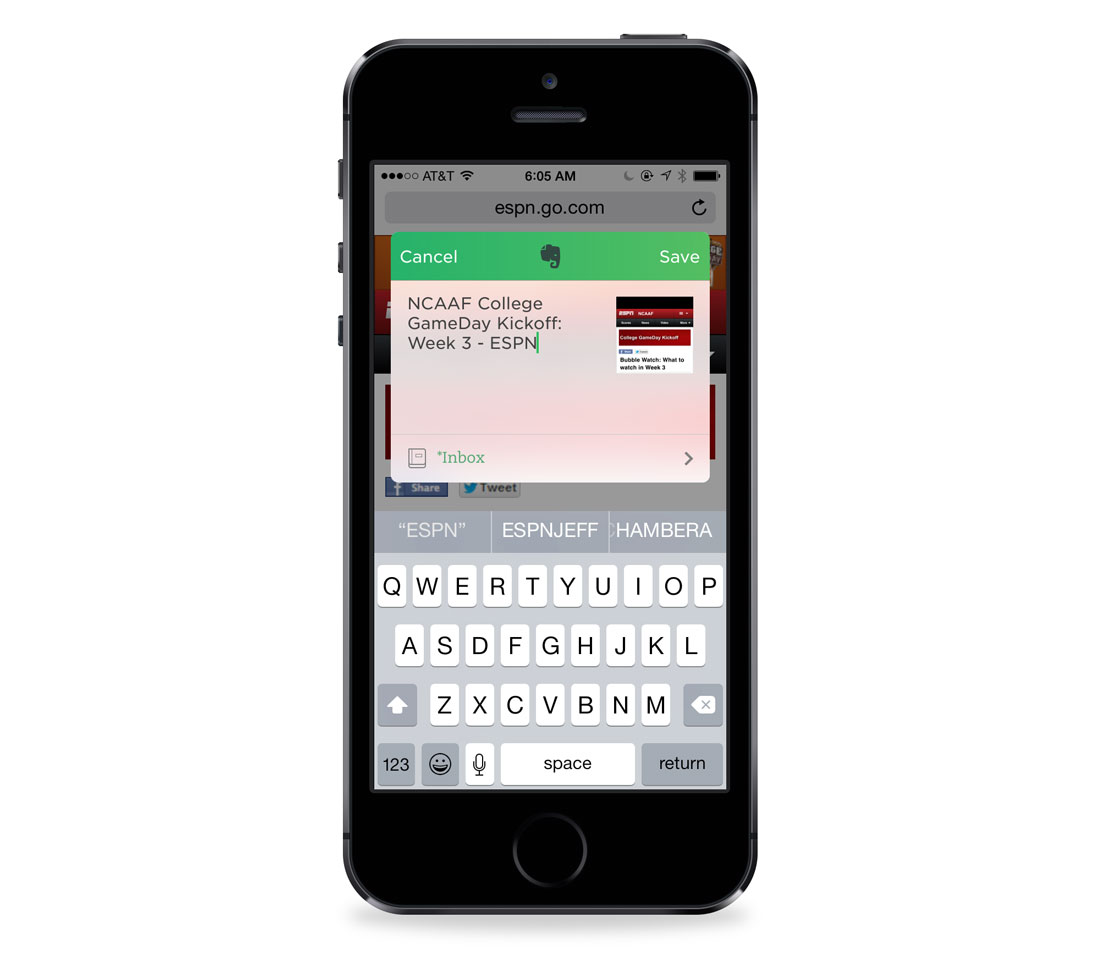
If you browse to an article that you want to save to Evernote, you can go to the share menu, and you (after enabling) will see an option to share to Evernote.

Evernote Sharing options

After triggering the extension, you’ll see a window that allows you to customize the title and pick which notebook. This functionality will also work with PDFs that are open inside of Safari. After saving the file, you’ll find it inside of your Evernote database.

Evernote Web Clipper

You can read more about the Evernote update in this review by our friends over at MacStories.

1Password updates »

1Password for iOS has come a long way. The first version was released back in 2008 and was a shell of what it currently offers for iOS. For instance, there was no Dropbox Sync, only Wi-Fi-based sync. Fast forward to 2014, and 1Password is our favorite password manager for iOS. It’s lightning fast with Dropbox Sync, iCloud Sync, and also has a fantastic web browser.

1Password for iOS was always limited on iOS due to the way Apple controlled the web browser and inter-app communication. With iOS 8, 1Password takes a major step forward with three major changes to the app.

  1. Touch ID integration
  2. Safari Extension
  3. App Extension

Touch ID with 1Password

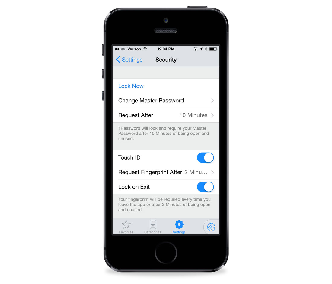
Touch ID was a hardware feature on the iPhone 5s, but iOS 8 opened it up to third-party developers. Now, instead of using your (hopefully) long master passcode to unlock 1Password, you can use your fingerprint. This will be a welcome change for those of us with cryptic passwords.

1Password’s Safari Extension

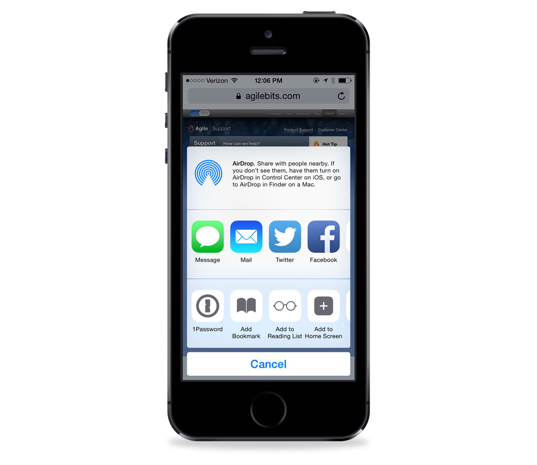
1Password on the Mac has always been tightly integrated into the web browsers. CMD + \ is the shortcut password to launch the login extension. It’s become such a well known shortcut, that the team at AgileBits released a t-shirt in honor of it. With iOS 8 support for extensions, 1Password is now able to extend its ability outside of the app. While there is no CMD + \ on iOS, the share menu will have a 1Password option.

1Password sharing menu

For existing 1Password users, it’s a joy to see this functionality on iOS. You’ll be able to unlock 1Password by using Touch ID or your master passcode.

1Password Security settings

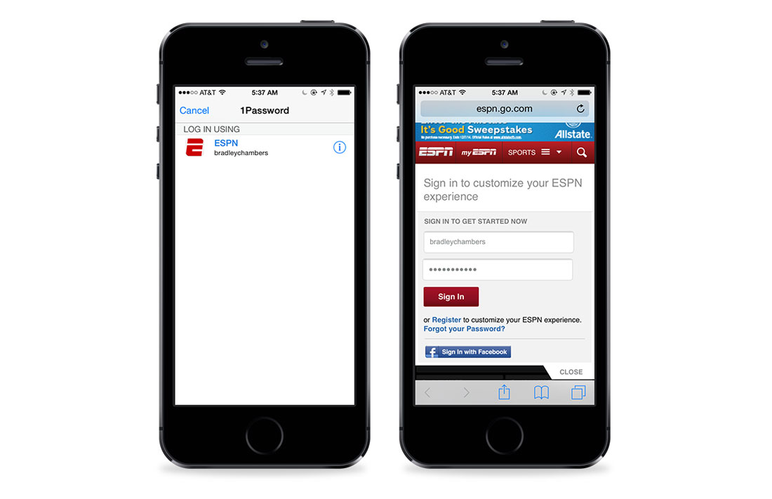
Once you are logged in, 1Password will show you the logins for that domain. Once you tap on the one you want, 1Password will disappear, and you’ll be right back in Safari.

1Password available in other apps

1Password’s App Extension

Back in June, the 1Password App Extension was announced. The 1Password Safari extension is a fantastic upgrade, but it won’t work inside other apps. You’ll see how much you need a feature like this if you ever set up a new iOS device from scratch. The 1Password App Extension will allow other developers to integrate 1Password login functionality directly into their apps.

A new, freemium Pricing Model for 1Password

With the release of version 5, 1Password is now free with an optional in-app purchase ($9.99). The free version can create and edit logins, credit cards, identities, and secure notes. It also syncs with other versions of 1Password. The Pro version unlocks multiple vaults, more organizational options, and more. Existing 1Password owners will receive all of the pro features for free.

At the end of the day, using 1Password effectively will make it easier to use longer and more unique passwords across all your apps and websites. These iOS 8 updates prove that the folks at AgileBits are staying on the cutting edge of iOS development.

VSCO Cam »

VSCO Cam, the best photo editing app for iPhone, just updated to version 3.5 in time for iOS 8.

New features include a slew of manual camera controls. Including control over exposure compensation, white balance, ISO, Shutter speed, and even a manual focus. For more info on how to best use the new features, VSCO has published a series of tutorials.

VSCO Cam is free on the App Store, with optional preset packs available as in-app purchases.

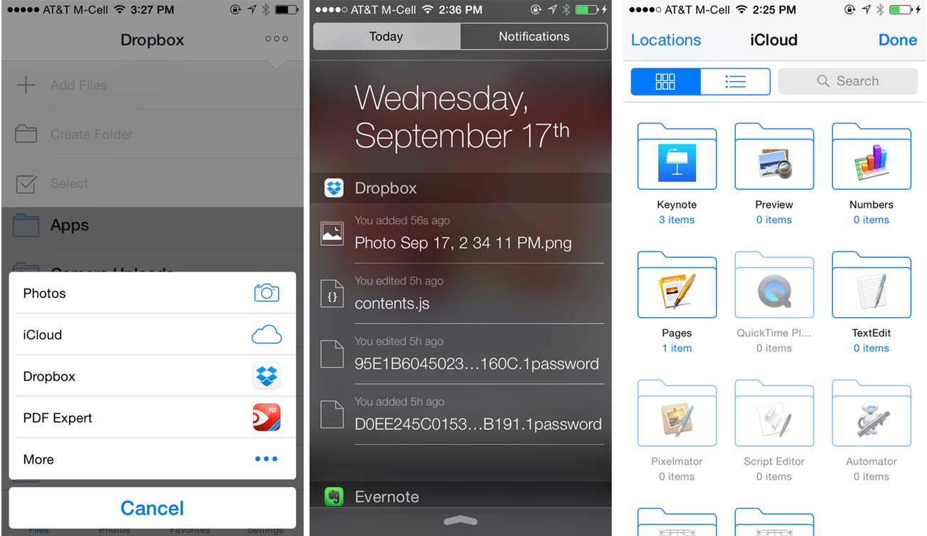
Dropbox »

Dropbox just released an iOS 8 update. Along with bug fixes, it contains a number of new features for iOS 8:

Dropbox iOS 8 updates

  • Manage and view shared folder permissions within the app
  • Supports uploading documents from iCloud Drive (and other storage providers)
  • Adds an option to display recent activity as a widget in the Today view
  • Enables support for Dropbox as a storage provider for other apps, so you can open your files directly from within other apps. In our usage, we haven’t yet been able to get the Dropbox document picker to work in other apps. It may take a bit of time as apps are updated for it to begin working as expected.

OmniFocus 2 for iPad »

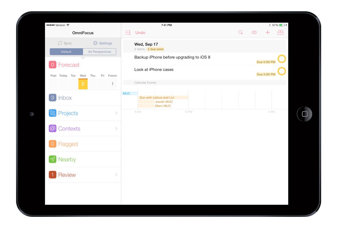
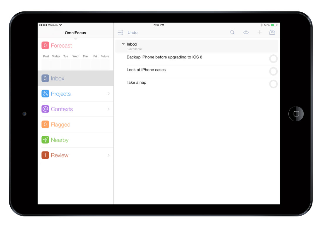
Along with the free iOS 8 update for OmniFocus for iPhone, The Omni Group has released acompletely overhauled version of the iPad app. It contains all the great iOS 8 features along with a modern iOS design.

OmniFocus 2 for iPad Forecast view

OmniFocus 2 for iPad inbox view

The previous version was pulled from the App Store earlier this year as this version was announced as a paid upgrade. The previous OmniFocus iPad app was many people’s favorite version of the 3-app suite, so we can’t wait to use the updated version day to day.

OmniFocus 2 for iPad is $29.99, and there is an optional Pro upgrade for $19.99 (in-app purchase) that will allow the ability to create your own view settings, searches, and filters. Also, with the Pro upgrade for OF2 on iPad you’ll be able to arrange the top-level sidebar to have faster access to your most-used perspectives.

The Pro upgrade will be free for existing OmniFocus for iPad users. For more information on the Pro upgrade, visit The Omni Blog.

For more info, you can check out the reviews by our friends, Federico Viticci and David Sparks. Also, the OmniGroup has published a free eBook manual that goes in-depth regarding OmniFocus 2 for iPad.

Day One »

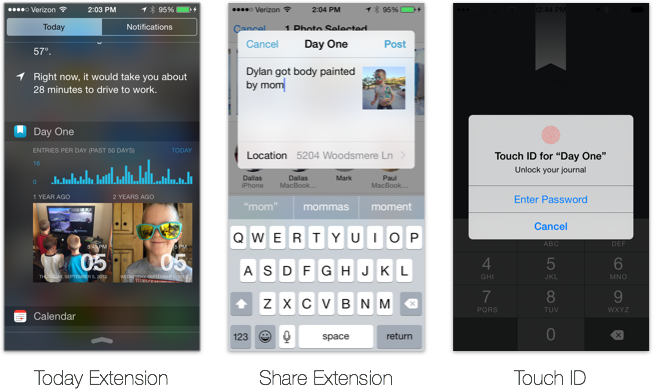
If you’re looking for a fantastic journaling app, or a great app for logging and recording various events and milestones of your life, then by far and away the best pick is Day One.

Today, Day One has been updated to take advantage of many of the new features in iOS 8. In addition to being ready for the larger screens of the new iPhone, the Day One app can now be unlocked using Touch ID. Moreover, there is a widget for Notification Center that will show you a small graph of your journaling habits over the past 50 days and two images from your journal timeline — either from a year ago today, or random.

Day One for iOS 8

The Notification Center widget is a great way to bring up your past memories and photos and also to encourage you to keep logging new entries.

And lastly, Day One has a system-wide extension so you can send photos and entries to the app from just about anywhere.

Day One is a universal app and is available now for just $4.99.

Things »

The task management app, Things, has received a nice update today as well. The new version of Things for iPhone sports a refreshed design that is more in line with the iOS 7/8 aesthetic, an Action Extension that lets you send to-do items from Safari right into Things as a new to-do item, background app refresh, 64-bit support, and even a new icon.

Things Action Extension for iPhone

The update will be making its way to the iPad soon, and the Cultured Code team has said they are working on a widget for the Today view in Notification Center that will show you all your current to-do items.

Clear »

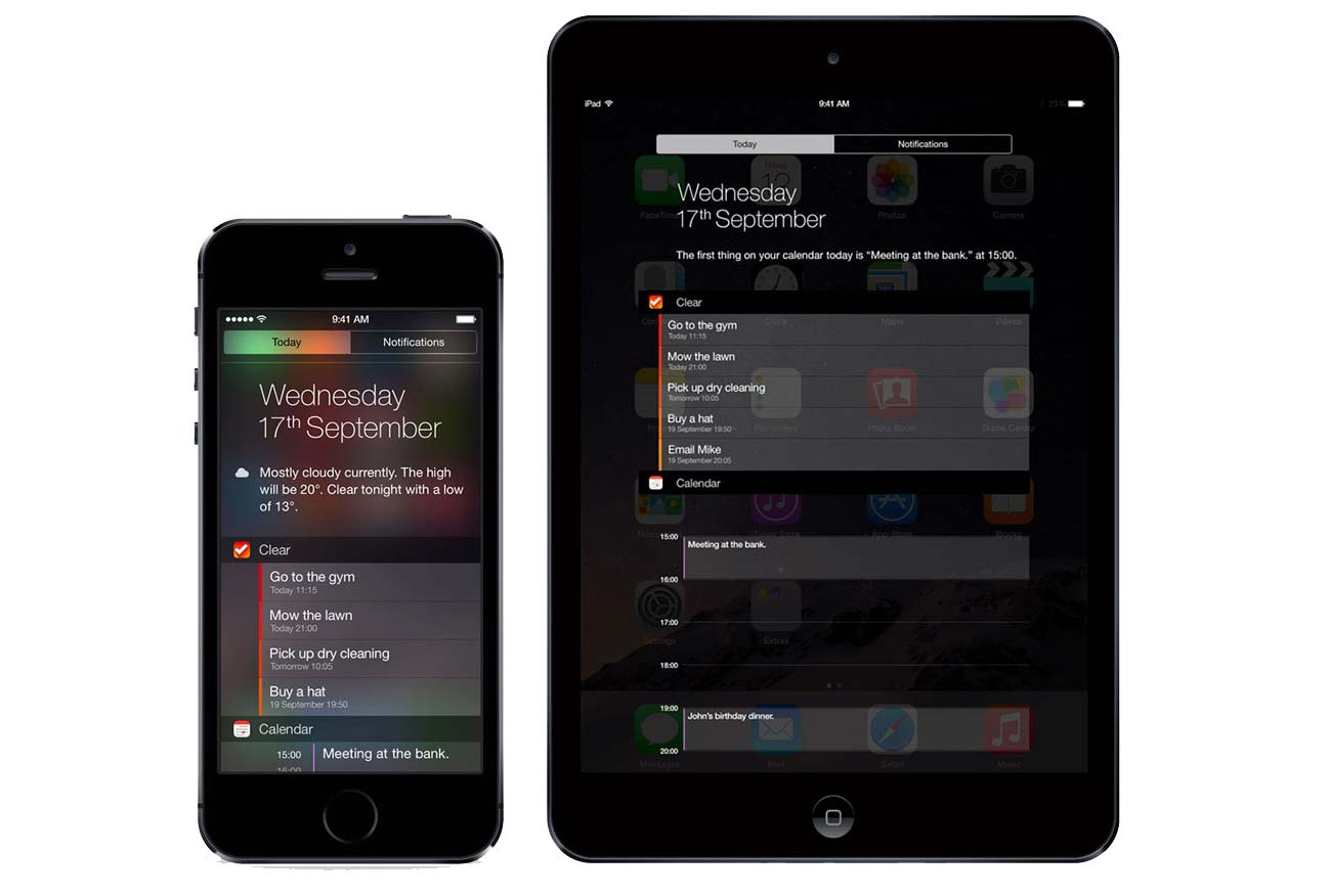
Along with its task-management peers, the awesome and simple to-do list app Clear has been updated to sport a neat new feature for iOS 8: a Today View Widget.

Clear's Notification Center Widget

Installing it is simple: just head to the Today view in Notification Center and add Clear (see above for how to add widgets). You’ll get a handy view of your upcoming reminders, and with a single tap you can view them in Clear. Mark a task as completed in Clear and the widget will immediately remove it from the list.

Just one more reason why Clear is our favorite simple to-do list app.

Instapaper 6 »

The team at Betaworks have released Instapaper 6 for iOS 8, and it’s a doozy. Here’s a quick rundown of all that’s included in what is a Home screen app for many of us:

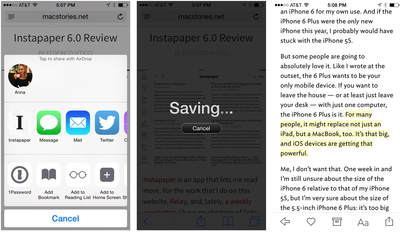
instapaper-ios-8-update

  • New, freemium business model: The app and service are now free, and there is a new Premium membership ($3/month or $30/year) that unlocks special features such as full-text search and unlimited highlights.

    All existing subscribers will be automatically upgraded to Instapaper Premium, and will be grandfathered at their current subscription price. Anyone who bought the app before today will get a free month of Instapaper Premium.

    I’ve been an Instapaper subscriber for quite a long time, and for how much I use the app to save, read, and highlight things. Since I’m already a Premium Subscriber, I’ll get grandfathered in at my previous rate of $1/month, but even the $3/month subscription would be well worth it for me.

  • System-wide “Save to Instapaper” extension: This is a total game-changer. This is what we’ve wanted from the beginning. Any app with a share sheet can now send content directly to Instapaper. No more bookmarklets or other silly workarounds.

  • Text-to-Speech:Accessed from Instapaper’s share sheet, this feature will read an article aloud to you, the playback of which can be controlled from the lock screen much like a song or podcast. If you’re a Premium member, you can create playlists of articles for speech playback.

  • User profiles: Your liked articles now appear in a publicly-visible profile that can be shared with others, unless you choose to make your account totally private.

  • And more: such as a unified browse section, where the Feature, Daily, & Friends sections have all been combined into a single feed. And a Today extension for Notification Center that displays everything you’ve saved today and lets you open articles with a tap.

Transmit iOS »

Panic, the developers behind great apps like Coda, Diet Coda, Transmit, Prompt, and more, released Transmit iOS today alongside iOS 8. Like all the other apps that Panic make, it’s incredibly powerful and pleasing to the eyes.

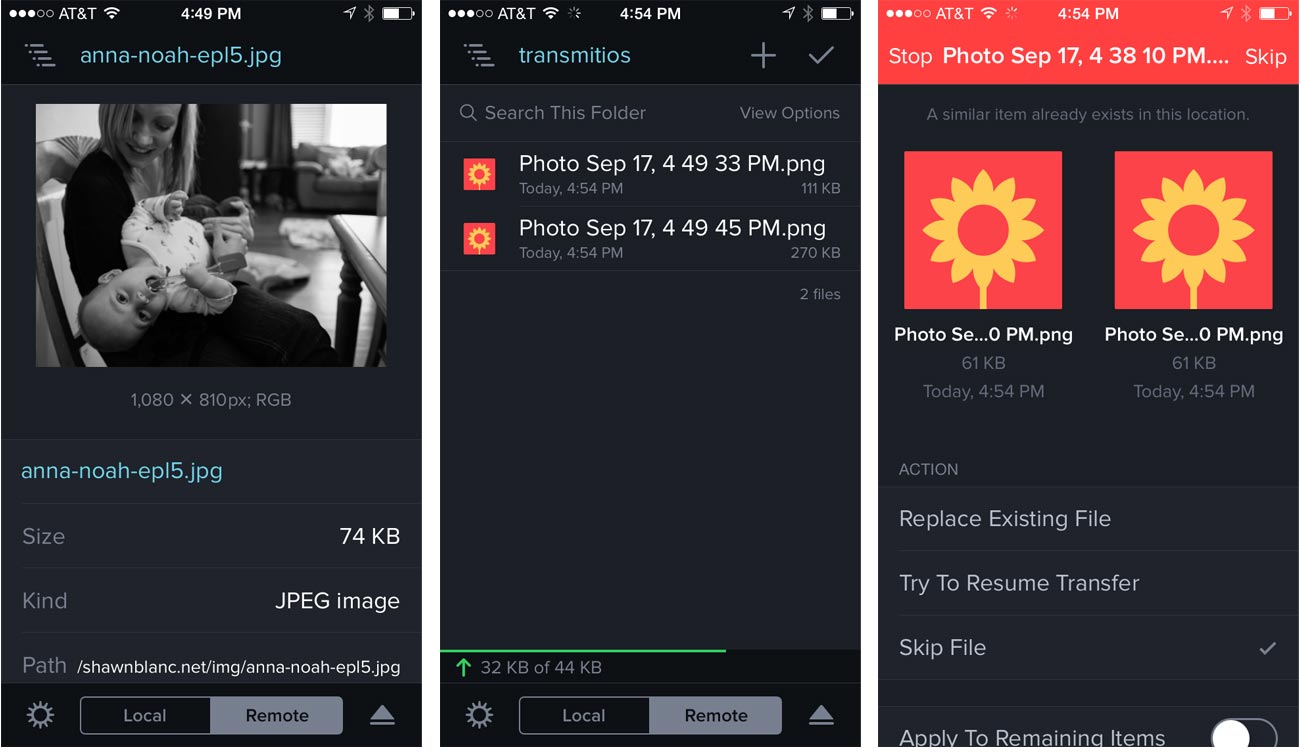
transmit-ios

An app like Transmit wasn’t really possible before iOS 8, due to the limitations in accessing documents in other applications. Panic describes Transmit as “the world’s best file transfer client for iOS,” and we totally agree. This app is mind-bogglingly great.

Transmit iOS sports the same engine as the Mac version, so it automatically supports all of the most common FTP protocols, such as FTP, WebDAV, Amazon S3, and more.

There are many other great features included in the app that are made possible by iOS 8, including TouchID security for server access, the new iOS Document Picker, and a sharing extension that works in any app that supports the Share sheet. Oh, and it looks fantastic as well.

Transmit iOS is a universal app and is on sale for just $9.99 for a limited time to celebrate the release. Wow.


This is a “living” post that we’ll be updating throughout the day as new apps go live in the App Store.

You can check back here, and/or follow us on Twitter.

Read the whole story
benwhiting
3716 days ago
reply
This is a fantastic breakdown of some of the new iOS 8 features being utilized by top app developers.
Fort Worth, TX
Share this story
Delete

1Password App Extension for iOS 8

3 Comments

AgileBits explains what the 1Password extension for iOS 8 will be capable of:

  1. Access their 1Password Logins to automatically fill your login page.
  2. Use the Strong Password Generator to create unique passwords during registration, and save the new Login within 1Password.
  3. Quickly fill 1Password Logins directly into web views.

If you're a developer working on an iOS 8 app that includes user registrations and logins, I strongly recommend considering the upcoming 1Password extension. The integration with the OS and the main 1Password app is incredible, especially if you're used to the limitations of iOS and the things you're not supposed to have on an iPhone or iPad.

The fact that the extension will also offer a password generator is a solid incentive to implement it – you'll give 1Password users a way to easily retrieve and create secure passwords within the context of your app. This is one of the most exciting changes coming with iOS 8 (and there will be many).

For a technical read, check out this post from AgileBits' blog.

∞ Read this on MacStories

Read the whole story
benwhiting
3740 days ago
reply
Ah--I see. I can use Dropbox, so sync hasn't been an issue for me.
Fort Worth, TX
Share this story
Delete
2 public comments
sirshannon
3742 days ago
reply
This is going to be great. Hopefully LastPass does something similar. I use Windows + OS X and want syncing across both so I use LastPass instead of 1Password. If I ever make it to a place where I don't use Windows at all, I will switch to 1Password + iCloud sync.
benwhiting
3740 days ago
The trial version of 1Password on Windows lets you sync and use all your items--you just can't add new ones. It works for me.
sirshannon
3740 days ago
Not being able to add new items is a deal breaker but even if that wasn't an issue, having to manually sync from my phone to Windows via an ad-hoc wifi network connection? No thanks.
adamcole
3739 days ago
I use Mac at home, iOS on portable, Windows at work--bought all the 1PW apps when they were reduced price over the years and couldn't be happier. But even at reduced cost it wasn't cheap.
adamcole
3742 days ago
reply
I would literally pay $100 for iOS 8 if its only change was implementing this one extension.
Philadelphia, PA, USA

TEENAGE MUTANT NINJA TURTLES – Brian Tyler

1 Comment

teenagemutantninjaturtlesOriginal Review by Jonathan Broxton

The Teenage Mutant Ninja Turtles were all the rage for a few years when I was a kid in the 1980s, although to be fair I didn’t know they were ninjas until quite some time later, thanks to the busybody interference of the self-appointed guardian of Britain’s national morals, Mary Whitehouse, who decided that showing children scenes of ninjas doing things with nunchaku would contribute to the decline of a generation. To me they will always be the Teenage Mutant Hero Turtles, and no-one can tell me otherwise, although looking back I now realize I never was entirely sure how Michelangelo defeated his foes with nothing more dangerous than a slice of pizza. This has been an astonishingly long-lived franchise – with the world having already been exposed to three separate animated TV series, a Japanese anime, a live-action TV series, we are now on our fifth movie based on the characters originally created by Kevin Eastman and Peter Laird in 1984, following the original three movies in 1990, 1991 and 1993, and the 2007 CGI flop “TMNT”. This latest installment is essentially an origin story reboot of the entire story, stars Megan Fox and Will Arnett, and is directed by Jonathan Liebesman.

The music of the Teenage Mutant Ninja Turtles films doesn’t have the most distinguished history; Monty Python music maestro John Du Prez scored the first three films, but very little of his music saw the light of day on CD, and Klaus Badelt wrote a decent but little-remembered action score for TMNT in 2007. Enter Brian Tyler; having become Marvel’s go-to guy for music, with the scores for Iron Man 3 and Thor: The Dark World already under his belt, and the score for Avengers: Age of Ultron yet to come, Tyler looks set to challenge Hans Zimmer for the title of King of All Super-Heroes, and his score for the Turtles continues the trend of him writing strong, powerful, thematic orchestral scores in the grandest symphonic traditions.

Brian Tyler has been writing wonderful music for Jonathan Liebesman’s films for over a decade, ever since he scored the director’s feature debut, Darkness Falls, in 2003, and Teenage Mutant Ninja Turtles continues the trend. Anyone who has listened to a Brian Tyler action score in the last four or five years will know exactly what to expect: a large orchestra, a large choir, a strong main theme, lots of complicated action writing, and a sense of scale and volume that few composers can match these days. The main theme, first heard in the opening cue “Teenage Mutant Ninja Turtles” and reprised fully in the conclusive “TMNT March”, is a belter: brass-heavy, powerful, heroic, and often accompanied by a soaring choir. It has a few superficial similarities to his themes from both Thor: The Dark World and Iron Man 3, but on the whole this is immaterial. Tyler is pretty much the only guy writing memorable, recurring themes for super hero movies these days, and we need to be thankful for that fact alone.

The action music, by and large, is fast, dense, and lots of fun. Cues like the astonishing “Splinter vs. Shredder”, “Turtles United”, “Shellacked”, “Shortcut”, “Cowabunga”, and the enormously exciting “Adrenaline” are barnstormers. Most of them feature strong performances of the main theme, and all are embellished by flamboyant touches in the string phrasing, the brass countermelodies, and in the percussion patterns that underpin everything. “Splinter vs. Shredder” and “Shortcut” are especially noteworthy, with their chanted choral parts, back-and-forth brass writing, furiously slashing string runs, complicated rhythmic elements, and general sense of epic grandeur. For the most part, the electronic elements of the score are kept to a bare minimum, simply doubling the percussion or adding a secondary level of bubbling bass. It’s unobtrusive, but maintains a level of ‘coolness’ for contemporary audiences.

By way of comparison, some of the brass triplets remind me a little of James Horner’s most recent action music, especially scores such as Avatar and The Amazing Spider-Man, while some of horn/flute trills recall Michael Giacchino’s Star Trek music. Similarly, the penultimate cue “Buck Buck” has a touch of the best parts of Hans Zimmer’s Man of Steel about it; to be clear, all of these things are good things.

To hint at the Oriental origins of the quartet, Tyler peppers his music with an occasional taste of the land of the rising sun, with trilling Japanese bamboo flutes and immense taiko drums underpinning several tracks. Cues such as the aforementioned “Splinter vs. Shredder”, “Origins” and “Shredder” play up this aspect of the score, and give it a different flavor than some of its contemporaries that is very appealing.

If Teenage Mutant Ninja Turtles has a downside, it’s its total and utter lack of subtlety. I’m not saying that a comic book film about crime fighting amphibians requires the restraint and sensitivity that a more grounded movie needs – things need to be larger-than-life – but Tyler scores almost every scene in the film with apocalyptic bombast, as though every moment is the most important moment of the story, and by the end of the 70-minute album I can anticipate some listeners will find the whole thing a little overwhelming. There’s very little sense of anticipation, build-up and catharsis; the score whangs you over the head from the first moment of the first cue, and continues whanging you over the head virtually the entire time until it’s all over.

As such, there only a few moments of downtime. “Adolescent Genetically Altered Shinobi Terrapins” has some soothing choral work, an intimate piano element, and a mystery-shrouded little cello figure reminiscent of Tia Dalma’s theme from the third Pirates of the Caribbean film. Later, “Origins” features some lovely harp glissandi, “Brotherhood” features an emotional string-and-choir theme that is quite exquisite, and “Rise of the Four” revisits the emotional choral panache heard during the opening moments of the first cue, before segueing into yet another rousing performance of the main theme. Finally, at the very end of “Buck Buck” a soothing electronic guitar element comes to take center stage, providing a sentimental, but defiantly contemporary coda to all the chaos.

Having covered those caveats, I have to say that in terms of sheer entertainment value, Teenage Mutant Ninja Turtles is one of the most enjoyable scores of 2014 for me so far. Unpretentious scores which kick ass while wearing their hearts on their sleeves are hard to come by these days; too many scores, especially in the super hero genre, have begun take themselves far too seriously, eschewing escapist entertainment in favor of tortured, dark tales of retribution and twisted morality. Teenage Mutant Ninja Turtles is the antidote to all that, but being unpretentious and entertaining doesn’t mean sacrificing musical creativity or compositional dexterity, which Tyler once again proves he has in spades.

Buy the Teenage Mutant Ninja Turtles soundtrack from the Movie Music UK Store

Track Listing:

  • Teenage Mutant Ninja Turtles (4:45)
  • Adolescent Genetically Altered Shinobi Terrapins (4:31)
  • Splinter vs. Shredder (6:25)
  • Origins (6:02)
  • Brotherhood (1:19)
  • Turtles United (4:10)
  • Rise of the Four (3:34)
  • The Foot Clan (3:17)
  • Shellacked (6:47)
  • Project Renaissance (1:57)
  • Shortcut (4:41)
  • Shredder (5:59)
  • Cowabunga (4:35)
  • 99 Cheese Pizza (1:49)
  • Adrenaline (6:26)
  • Buck Buck (4:11)
  • TMNT March (2:07)

Running Time: 70 minutes 02 seconds

Atlantic Records (2014)

Music composed and conducted by Brian Tyler. Orchestrations by Brian Tyler, Robert Elhai, Brad Warnaar and Robert Lydecker. Recorded and mixed by Greg Hayes. Edited by Joe Lisanti. Album produced by Brian Tyler.


Read the whole story
benwhiting
3744 days ago
reply
I love this score--tons of fun!
Fort Worth, TX
Share this story
Delete
Next Page of Stories